How to publish data directly into a dashboard that you can share with team members, clients, or anyone who needs to view it.
Enhance your data collection with dynamic dashboards
When you’re collecting primary data, it’s not often realistic to get a snapshot of data only when you’re done with your data collection project. Whether you’re collecting survey data for research or for monitoring and evaluation (M&E), it’s likely that you need, at some point, to view raw data while data is still coming in.
Enter: data visualization dashboards! As data comes in from your survey platform, it’s possible to set up automations that allow it to be published directly in Google Sheets in a way that’s visually appealing and accessible to your entire team.
A lot of research, M&E, and data collection is done as part of a team, so it can be incredibly valuable to have a central place where team members can all easily view progress and survey results.
When data is accessible in dashboards that publish data as it is collected, everyone in a team can know what’s going on and bring in their expertise to the data analysis process.
If you provide research as a service or work with external funders, organizational partners and other stakeholders, you know how important simple visualizations of the data you’re collecting can be. You also probably know it’s often challenging to efficiently share data with stakeholders who aren’t a part of your internal team. Google sheets dashboards can be an effective tool here, allowing you to share exactly what your stakeholders need to know in an easily accessible format.
In this post, we’ll walk you through how to create dynamic dashboards in Google Sheets. We’ll share some tips and tricks we’ve learned the hard way from years of building custom dashboards. Finally, we’ll give you access to sample dashboards and templates so you can easily build your own.
Why Google Sheets? And what is a dynamic Google Sheets dashboard?
We like Google Sheets for many reasons. Google has expended considerable effort in making Sheets powerful, reliable, and an excellent collaboration tool while remaining relatively simple to learn and use. Many, many people have Google accounts, making it a great option if you’re working with different organizations or outside partners. It’s also easy to use Sheets to create a central dashboard accessible to everyone who needs it.
A dynamic dashboard in Google Sheets means that data is being updated periodically – as close to “real time” as possible. Static dashboards can be good tools for collecting and organizing data for reports, but they need to be updated manually as new data is collected. With a dynamic dashboard, the dashboard automatically updates as new data is collected, so anyone viewing the dashboard knows they have the latest data.
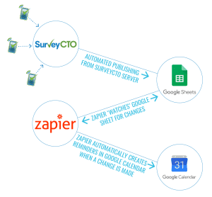
Data collection tools like SurveyCTO allow you to publish incoming data directly from the server to Google Sheets, so you can create dashboards that present up-to-date summaries of your data. You can then use these dashboards to monitor the progress of your surveys, flag errors to control data quality, share real-time results with your team and partners, and more.
Who needs dynamic Google Sheets dashboards? Popular use cases
Anyone collecting large volumes of data over time can use dashboards. They are useful across a variety of industries, since visualizing important data is beneficial for both internal and external stakeholders. In particular, these two main groups may find dynamic dashboards especially valuable:
Monitoring and evaluation (M&E) professionals: M&E professionals tend to measure the same subjects over time (longitudinal data collection). By publishing directly to a Google Sheets dashboard, M&E professionals can visualize and share that dynamic, ongoing data collection.
Survey firms and research service providers: Anyone who is using a data collection platform like SurveyCTO to collect data for clients needs a way to share that data with them. Many clients want a downloadable PDF report, but increasingly, clients love being able to collaborate over cloud-based platforms like Google. For example, if a survey firm is in charge of surveying 1,000 people over a 3-month span of time, they can create a Google Sheets dashboard where data is published. Instead of creating endless versions of PDFs, their clients can pop in and visualize the results, even as data collection is ongoing.
Regardless of what field you work in, if you collect data and want to use Google Sheets dashboards to visualize it, there’s a few important things to know that can help you get started.
These are the Google Sheets functions you need to build dynamic dashboards
To build Google Sheets dashboards, you don’t need to be a wizard at all Google Sheets functions, but it’s helpful to know a few basics. Some of the most useful functions are:
- [VLOOKUP] – This function lets you search for data in a column, and return data from that row if a match is found. Use it to pull data from one table into another in a Google sheet that you’re storing your raw data in.
- COUNTA() – This function will count all values in your dataset, including those which appear more than once.
- AVERAGE() – This function returns the numerical average value in a dataset. Use it directly in your dashboard to calculate the average interview time for a survey, and more!
- ARRAYFORMULA() – This function can be used to get an output from a range of cells, instead of just a single value. In other words, a normal formula outputs a single value, but array formulas output a range of cells! Use this powerful function to automatically calculate running metrics on your data.
Pro tip: Refer to entire columns — but skipping the first header row — with references like COUNTA(data!A2:A) or AVERAGE(data!G2:G).

Step-by-step instructions to build your dynamic Google Sheets dashboards
Let’s build a dynamic dashboard, one step at a time.
Step 1: Set up your sheet
First, create and title your Google Sheet. Depending on how your data is coming in, you may need to title your columns or the data may already be labeled. Then, map your data from the source to your Google Sheet. This step depends on which data collection tool or platform your data is coming from. If you’re sending data from SurveyCTO to Google Sheets, you’ll need to first set up dataset publishing for your form, and then configure publishing to Google Sheets.
Once you’ve set up publishing from your data collection tool to Google Sheets, test your setup to make sure submissions are appearing where you expect them to.
Be sure to keep your Google Sheet up to date. If you add new questions to a survey, you’ll need to add extra rows at the end of your Google Sheet to accommodate new data that streams in from a survey tool like SurveyCTO.

Pro tip: Enter placeholder data to leave space for new data. You may have to enter placeholder data into the last row of the spreadsheet if your data will be streaming in. Insert two blank rows; add a column, name it “unused”, and in the second blank row put “end” under that column. This creates a space into which new data can be published.
Pro tip: Create multiple dashboards on separate worksheets. You can even color code your dashboards, and move them first in the list of worksheets, so anyone accessing your Google Sheets file finds them easily.

Step 2: Build your dashboards — use pivot tables to summarize data
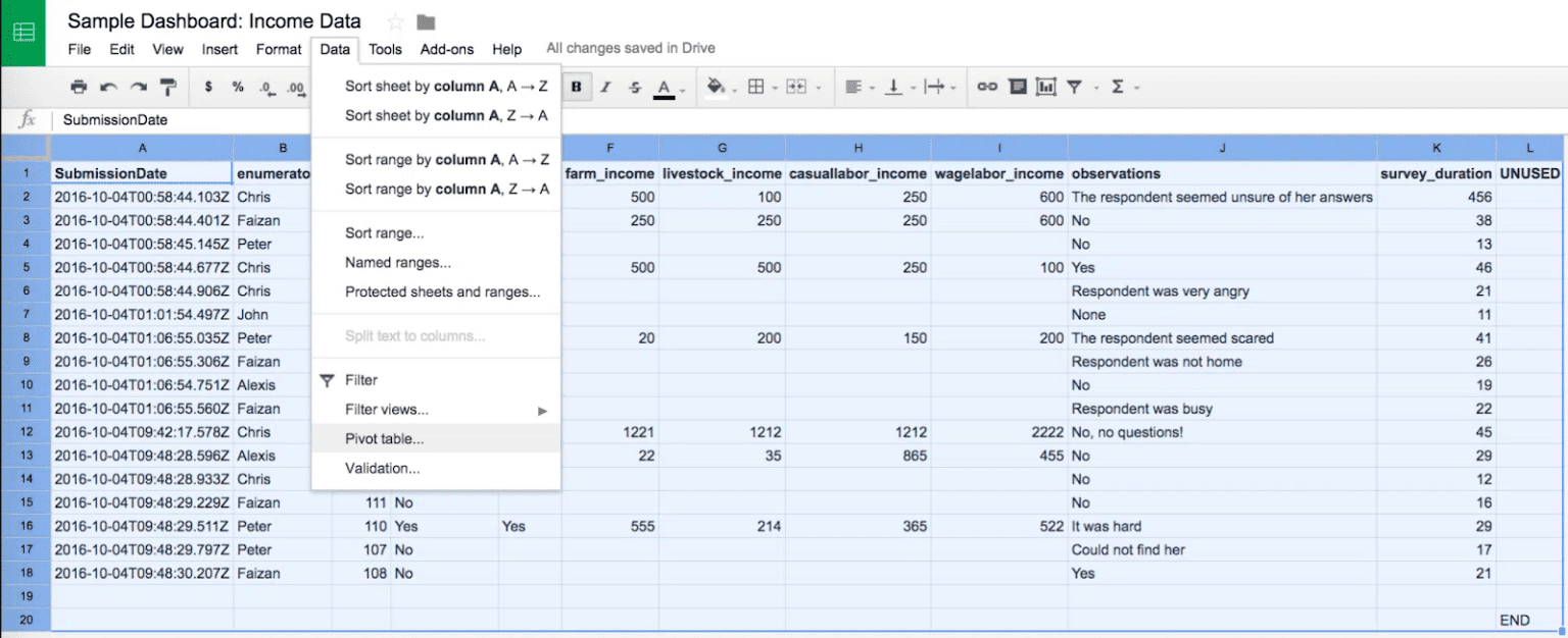
To summarize and analyze data, pivot tables are one of the most powerful tools available. Pivot tables are a flexible way to aggregate data. While you can always use functions or formulas to calculate data and answer questions in your Google Sheet, pivot tables enable you to answer questions about your data, like How many X is in this dataset? What is the total summary of these columns?
Pivot tables can be added as separate worksheets to a dashboard.
Pro tip: Highlight your entire data worksheet — not just the rows with data — before adding a new pivot table. That way, new data will also be included. (But we recommend hiding columns and rows with blank values.)
Step 3: Create charts to make a dashboard come alive
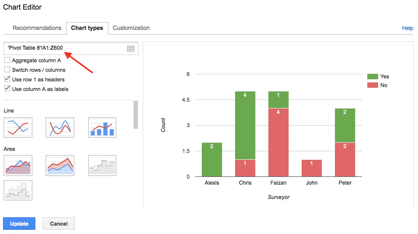
Charts make a dashboard come alive: you can create a chart from a pivot table, then cut and paste it into a dashboard. Edit the range for the chart’s input, to cover lots of extra rows and columns (e.g., change data!A1:B7 to data!A1:Z600). That way, the chart will include all of the new data as the pivot table expands!
Share your dynamic Google Sheets dashboards
This is the fun part: sharing your dashboards with your team and other relevant collaborators. Share your dashboards with exactly who you want, and de-identify data when necessary. Who you share your data with depends heavily on your project and task at hand, so we can’t provide blanket recommendations about how to share your dashboards. However, here are some tips to keep in mind as you share:
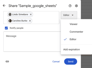
Give view-only or edit access to specific collaborators
Use Google Sheets share features to give view-only or edit access to collaborators. If somebody needs only temporary, read-only access, set their access to automatically expire so that you don’t have to go back to remove it later.
Publish your dashboards to the web
For dashboards you want to be publicly available, you can make them available to anyone with a link. Selectively publish only those charts or dashboard worksheets that you want to share openly.
Pro tip: Use the “embed” option to get code you can embed in an existing website. If you’re having display issues, try putting <p> tags around the <iframe> embed code.
Integrate your data using tools like Zapier or OpenFN
Use a service like Zapier or OpenFn to integrate your data with a host of other platforms for further data visualization, communication, reporting, and more. These are some of the platforms you can integrate your Google Sheets dashboards with:
- Mailchimp
- GMail
- Salesforce
- Twilio (SMS)
You can also connect Google Sheets dashboards to virtually any tool using an integration tool like Zapier.
Templates so you can create your own dynamic Google Sheets dashboards
Project managers have a lot on their plates, so we created a monitoring dashboard template flexible enough so that you can just edit it to fit specific fields in your survey forms.
Within the template, there are actually three templates:
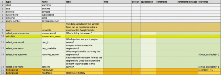
- a sample survey form
- a sample dataset that publishes data from this form into a spreadsheet in Google Sheets
- a sample spreadsheet that shows some examples of tables and charts that might be used in a dashboard.
What you need to know about each element of this template
The sample form is a short survey to collect data on whether patients in a particular region are able to seek health-care when needed and, if so, from which health facilities. The first part of the form also contains questions to track unsuccessful attempts to survey the respondent.
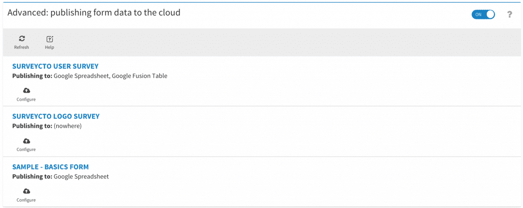
On the server, we linked this form to a dataset in SurveyCTO, so that selected data collected using this form is published into the SurveyCTO dataset as it is uploaded. The dataset, in turn, is linked to our spreadsheet in Google Sheets. As data is published into the dataset, this dataset publishes that data out to the spreadsheet.
The spreadsheet contains three tabs: raw data, tables, and charts. All raw data is published into the first tab. For easier reviewing, all summary tables and charts to monitor survey progress are contained in the second and third tabs, respectively. The formulas in these second and third tabs just refer to the raw data in the first tab. As new data is published to the spreadsheet, the summary tables and charts are automatically updated. To monitor progress, all you need to do is to review the dashboards in the second and third tabs whenever you want.
This template focuses on providing summaries so that you can easily monitor your team’s progress:
- a table that lists all respondents
- the total number of times each respondent has been visited
- whether the respondent has been successfully surveyed
- a table that shows the mean duration of surveys by enumerator
- a chart that tracks completed surveys by enumerator and compares them to unsuccessful visits by enumerator
- a chart that summarizes the reasons a respondent visit was unsuccessful.
In this sample template, we’ve provided a variety of tables and charts that tend to be useful across a variety of projects and situations. However, possibilities for dashboards and visualization are endless. You can create more complex summaries and tabulations in your spreadsheet – summarizing answer distributions for different multiple-choice questions, means of various numeric fields, tables that flag patients that missed their last required visit to a health facility, and more. The template is just meant to be a starting point, to give you an idea of the possibilities. You can edit, add, or remove elements as you require.
To try out the template:
1. Click here to see the live spreadsheet in Google Sheets, and click “File…Make a copy” to make an editable copy within your own Google Drive, to use it as a template.
2. Next, click here to download the sample form itself, which includes a number of comments to help explain the more complicated bits
3. Upload that sample form to your SurveyCTO console’s Forms tab to try it out.
4. Then, click here to download the dataset definition, which takes incoming data from the sample form and publishes it to Google Sheets
5. Unzip to get the .xml file
6. Click “Create dataset” on your SurveyCTO console’s Datasets tab, confirm you have a definition to upload, and upload the .xml file.
You’ll need to re-link the dataset to your own copy of the sample form spreadsheet for it to publish to the right place. See How to set up dataset publishing for details.
More dashboard resources, in Google Sheets–and beyond
As you’ve read through this guide, you might be thinking of your own workflows and processes, and how to take the tips and tricks you’ve learned here and make dashboards work for you.
One of the best ways to learn about creating dashboards is seeing what’s possible based on what other research and M&E teams have created.
One great resource based on a real-world example? The World Bank’s Development Impact Evaluation (DIME) group’s high-frequency check dashboards webinar. World Bank researchers use SurveyCTO and Google Sheets dashboards to systematically track and monitor survey data dynamically. Want to put what you’ve learned in this article into practice and build your own dashboard? Watch the webinar to learn more details and get you started.
Also, keep in mind that while Google Sheets is a powerful dashboard builder for data collection, it is not the only tool Google offers for this type of data visualization. Another popular tool is Google’s Looker Studio (formerly known as the Data Studio). Looker Studio lets you create powerful dashboards and reports that can summarize field work, track key performance indicators, and dynamically display your data to colleagues and stakeholders. Looker Studio dashboards are built on data from a Google source, such as a Google Sheet, and provide built-in, user-friendly options for many different kinds of graphs and charts for visualizing data. You can also blend data in Looker for maximum flexibility.
For a real-life look at this type of data visualization, check out the webinar on how SurveyCTO partner Trestle builds dashboards.
Finally, while Google’s tools for data visualization are excellent, it is also entirely possible to share visualizations of SurveyCTO data using the platform’s Data Explorer and adding stakeholders as External Viewers.
Remember: A project doesn’t end when the data is collected. What you do with the data affects the impact your project can have — from how you visualize it for your team and collaborators, to how you analyze it and report on findings. Dashboards are a highly effective tool in streamlining your post-data collection efforts. And with a bit of time, effort, and the right tools and tips, anyone can learn to build high-quality ones.


